Comparative Look at the CRB Index
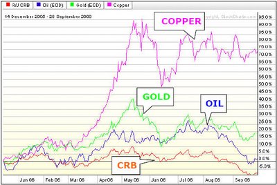
In the following chart, I've compared the CRB Index's performance since December to gold, oil, and copper. You see how oil (the blue line) closely follows the performance in the CRB Index. That shows you how energy-heavy the CRB is (We’re not showing sad-sack natural gas, a CRB component which drags the index down into the gutter).
My point: While we all talk about a commodity market, remember that it's a market of individual commodities. And some are doing better than others.


<< Home