Scary Freakin' Oil Chart!
I don't like to scare people. Okay, that's not true. In a previous life, I was a horror writer. But I capped my career mercifully short with an appearance in "The Year's Best Horror Stories."
Point is, the outlook on oil is downright scary. And I'm not the one writing this tale.
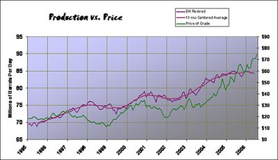
Below, you'll see a recent Chart from Oil CEO, who is linked on the right-hand side of my blog. It shows oil production versus price...

As you can see, historically, a rise in price has been preceded by a flattening or dip in production. That's just basic enconomics, and also historically, production follows price higher. What's scary right now is that prices are rising and production has plateaued. It seems producers CAN'T produce more oil. Read some of my previous blog posts to see why that might be.
Point is, the outlook on oil is downright scary. And I'm not the one writing this tale.
Below, you'll see a recent Chart from Oil CEO, who is linked on the right-hand side of my blog. It shows oil production versus price...

As you can see, historically, a rise in price has been preceded by a flattening or dip in production. That's just basic enconomics, and also historically, production follows price higher. What's scary right now is that prices are rising and production has plateaued. It seems producers CAN'T produce more oil. Read some of my previous blog posts to see why that might be.
Check out my new gold and energy blog at MoneyAndMarkets.com


<< Home